AI-driven CPAP mask recommendation
As UX Lead, I led the end-to-end redesign, delivering a faster, more accessible, and accurate product in 8 months.
Background
Sleep apnea affects an estimated 1 billion people worldwide, making it one of the most under-diagnosed chronic conditions globally. CPAP therapy is the gold-standard treatment, but its effectiveness depends entirely on mask fit. A poorly fitted mask leads to discomfort, air leaks, and ultimately therapy abandonment, which runs as high as 50% in the first year.
At the height of Covid-19, when in-person clinical appointments became impossible, ResMed created MaskSelector — a remote, AI-powered tool to help patients find their best-fitting mask from home, without an in-office visit.
My role
As UX Lead, I owned the end-to-end redesign of the patient scanning experience — driving product direction, defining success metrics, leading cross-functional workshops, and shaping the long-term product vision. I also partnered closely with ML engineers to keep design decisions technically grounded.
Working with the PM, User Researcher, Content Designer, Marketing and 10+ engineers, we launched the redesigned product to the North America market in under a year.
Opportunity
Remote patient onboarding was becoming a strategic priority post-Covid, and a broken workflow was actively undermining clinician trust in the product. MaskSelector had the right idea, but the original scanning experience had high error rates, confusing instructions, and a UI that didn't reflect what the technology required. Patients were failing before they even got a recommendation.
A new facial reconstruction ML model was the perfect opportunity to rethink the experience, with a clear goal: build a scanning workflow accurate and accessible enough to back with a full commercial launch.
❊
Aligning the Team
To kick off the redesign, I led a cross-functional workshop with 15+ key stakeholders. I synthesized existing research, mapped the technical constraints of the new model and designed activities around the question how might we capture the best quality scans with the easiest possible workflow? The goal was to build shared understanding of where the original experience had failed, ideate on potential solutions and align on two success metrics before a single screen was designed:
90%
model accuracy
95%
scan success
Workboards from the ideation workshop I organised
Defining Design Principles
Coming out of the discovery workshop, two principles became the foundation for every design and tradeoff decision that followed. These two principles also gave us a shared language for conversations with the ML and engineering teams when technical constraints were at odds with user needs.
❊
Flexible feedback
Instructions should respond to what the patient is doing in real-time, guiding them toward a successful scan without requiring a complete restart.
❊
Accessibility-first
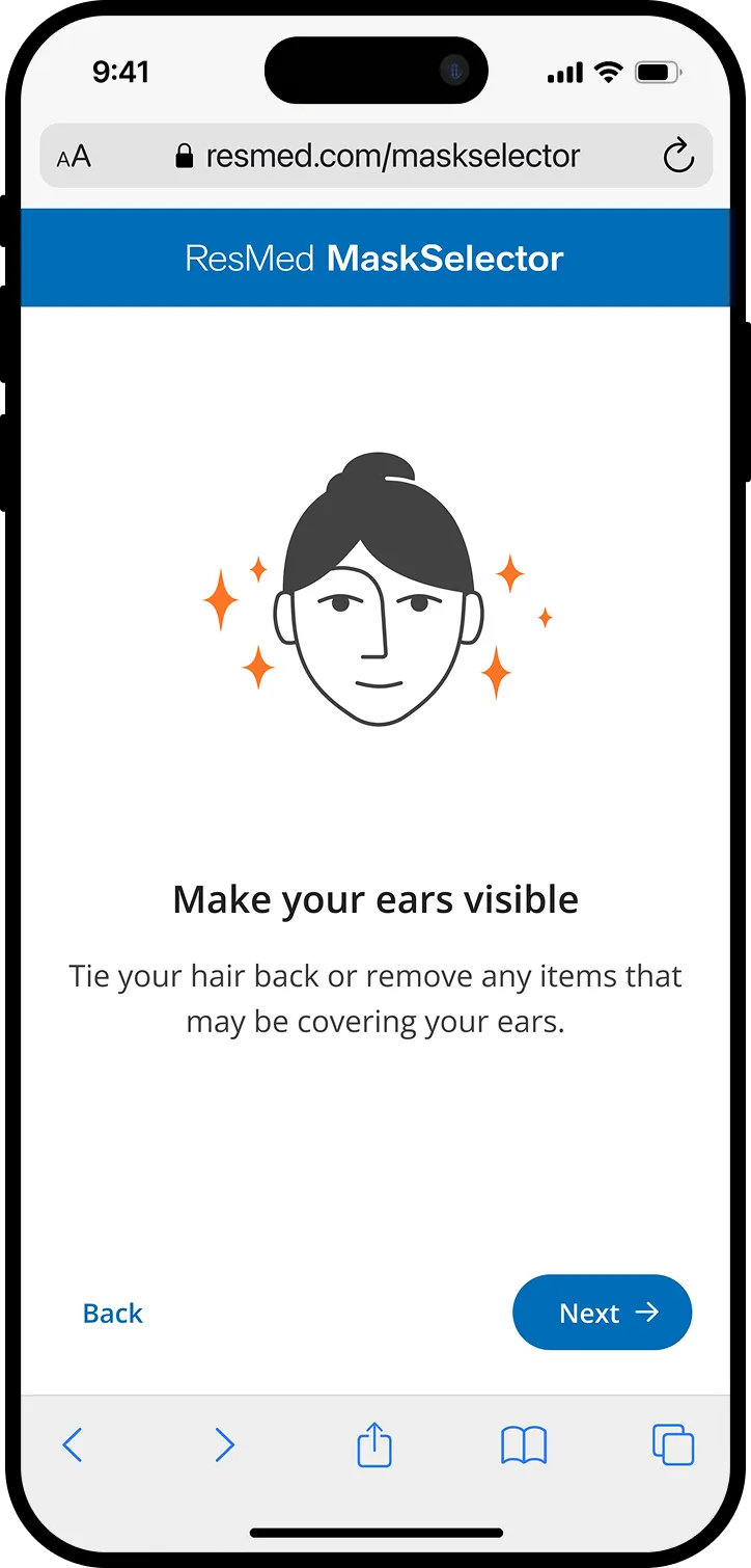
Patients should be able to complete the scan regardless of physical limitations (eg mobility, vision, hearing).
Validating a Direction
Two concepts emerged from the workshop, which I developed into prototypes and tested with users alongside our researcher. Option A used a highly prescriptive UI, guiding patients through exact head positions step by step. Option B took a looser approach, only showing patients the direction and how much more they should turn. Respondents overwhelmingly preferred B. Completion time reflected this: A took twice as long as B.
A
B
"It was so hard to get all three scans done, it took a very long time to get it positioned correctly."
-Test participant
We presented the findings to stakeholders with a clear caveat: the flexibility we were promising had to be technically supported, or we'd risk breaking trust all over again. With that alignment secured, we had our direction.
Iterating on the Core Flow
With a validated concept, we moved into rapid iteration, redesigning instruction screens for clarity and rebuilding the feedback system to guide patients mid-scan in real time. We ran 6 rounds of user testing over the course of this project to refine transitions and timing, staying in constant dialogue with the ML team to ensure our flow aligned with the model's required inputs.
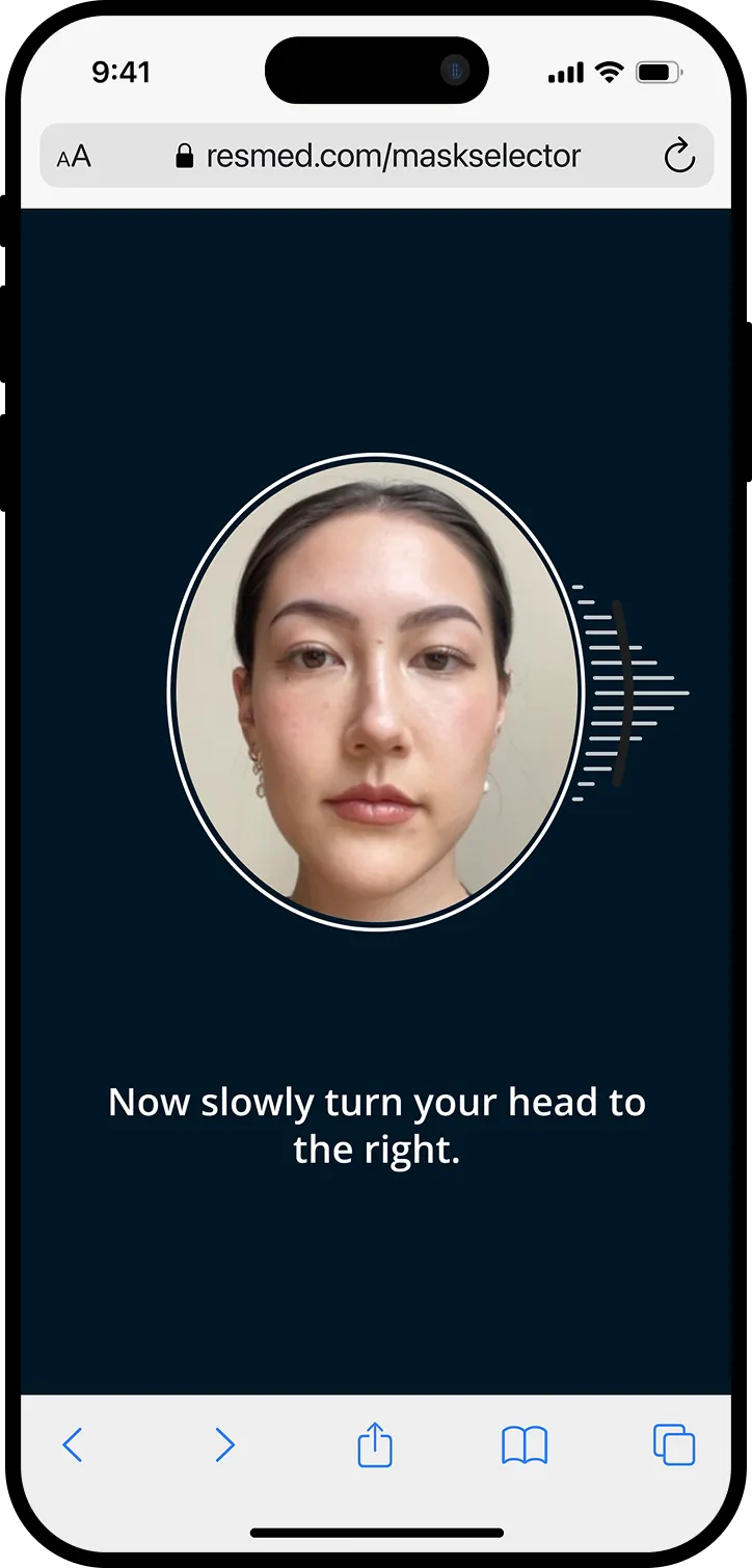
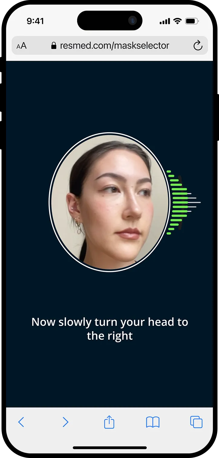
Key frames to capture the rightward scan. The same process applied for a left and up scan.
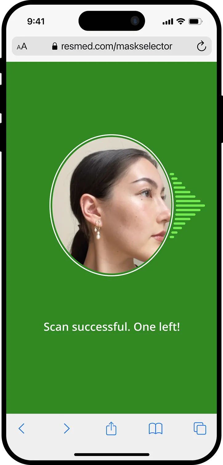
A key insight emerged late in this phase: the responsive feedback was guiding users so effectively that dedicated error states were no longer necessary. We removed them entirely and updated our success metric accordingly to an average scan completion time under 75 seconds.
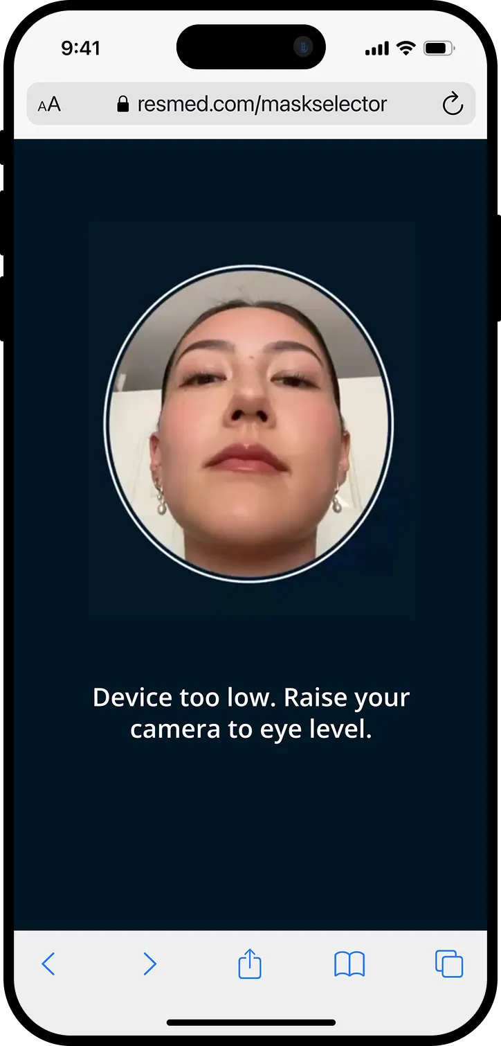
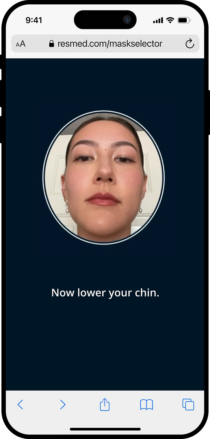
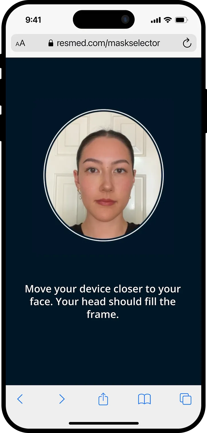
Examples of responsive feedback during the scanning process
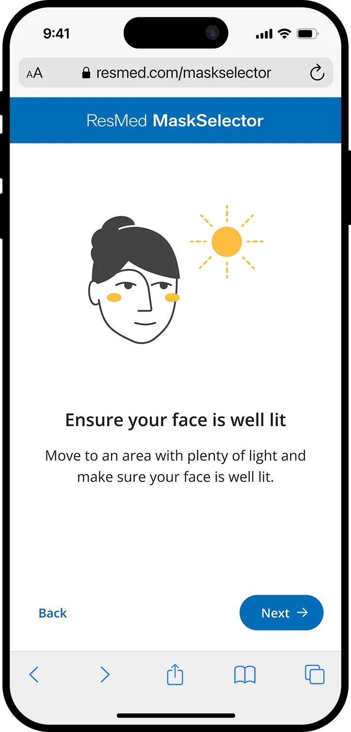
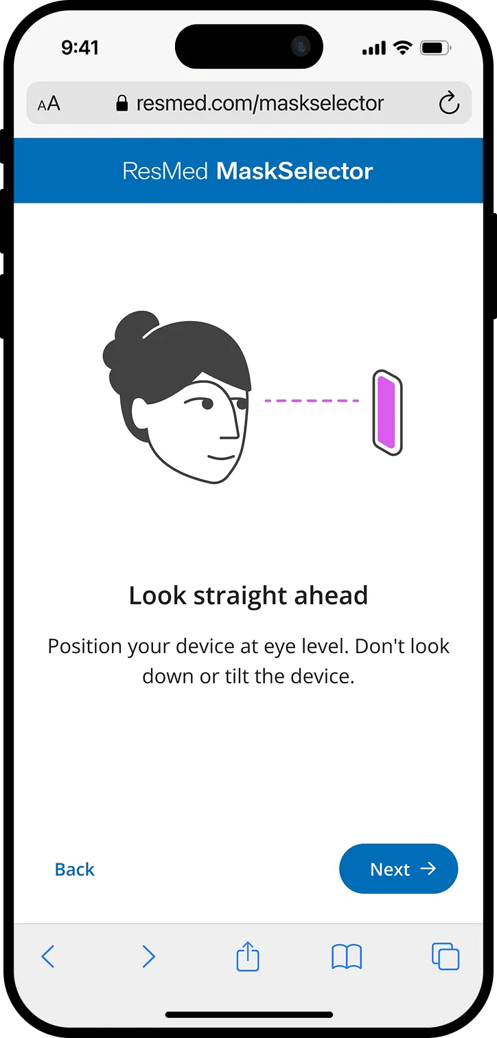
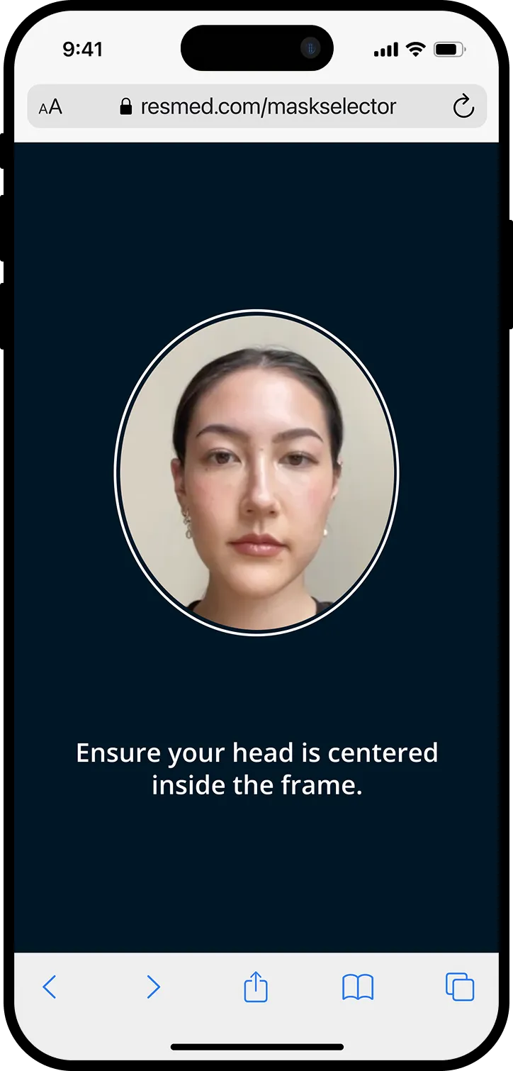
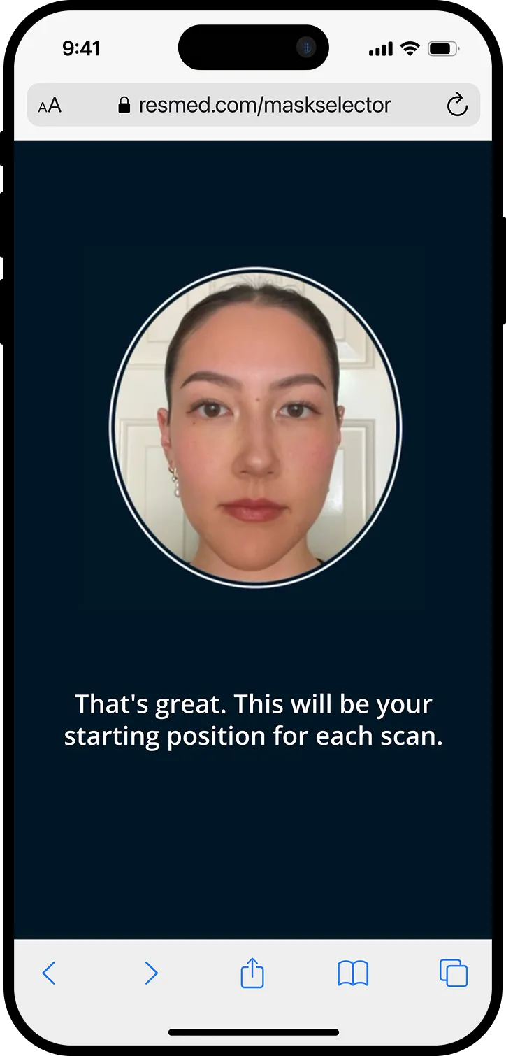
New pre-scan instruction screens to set users up for success
Designing for Accessibility
Instructions alone weren't enough. We layered in multi-sensory cues to ensure the experience worked for patients with limited vision or hearing. A successful scan triggers an audio beep alongside text-to-audio instructions, and a green circle radiates from the camera frame as a visual confirmation. We explored haptic feedback too, but ruled it out due to inconsistent support across browsers and operating systems.
Every cue was tested iteratively, ensuring accessibility was built into the core workflow from the start rather than added at the end.
Audio (press to play sound)
Visual
Final Polish
Six months in, with user testing scan times averaging around 75s and accuracy results exceeding 93%, I shifted focus from flow to finish. This meant sweating the details across micro-interactions, transitions, and small moments of delight. For example, in place of a standard loading bar while images uploaded, I designed a custom animation to hold the user's attention while scan images were being uploaded, making the wait feel intentional rather than dead time.
Custom loading animation
Outcome
The redesigned MaskSelector hit both success metrics, enabling the North America launch:
94%
model accuracy
<75s
avg. scan time
A full commercial launch is pending following a shift in business priorities, with internal sales teams already requesting the tool in other regions.
Early provider feedback confirmed what our testing had indicated: the new scanning workflow was meaningfully easier and more reliable than its predecessor.
Perhaps the clearest validation was what came next. The scanning interaction I designed was adopted as the foundation for Selfie Screener, a separate Resmed diagnostic product using a similar facial reconstruction ML model. With only minor modifications to meet new requirements, our workflow transferred directly to a clinical diagnostic context — confirming that what we built wasn't just a fix for one experience, but a foundational pattern for how ResMed approaches computer vision interactions going forward.
❊
Epilogue: Long-Term Product Vision
With final designs handed off, I took the initiative to synthesize everything learned across the project into a longer-term vision for the mask fitting problem space. I presented this to senior leadership, and it has since informed the roadmap for MaskSelector's next phase.
The current MaskSelector workflow was built around insurance-based markets like the US, but the underlying technology showed clear potential beyond that context. I mapped the broader mask fit journey to identify the highest-impact opportunities for the next phase of investment.
1x
Establish the foundation
Build an accurate, accessible scanning workflow to augment remote onboarding in insurance-based markets.
Mission accomplished!
10x
Scale commercially
Adapt the workflow for direct-to-consumer markets, giving patients the ability to find their best-fitting mask through an online shop without clinical involvement.
100x
Proactive mask care
Leverage the established computer vision interaction to identify mask fit issues over time, creating proactive adjustment and re-fit opportunities throughout the patient's therapy journey.
Key Learnings
- Design principles pay off in tradeoff conversations
Establishing "flexibility through live feedback" as a guiding principle gave the team a shared language and clarity. It turned subjective debates into principled decisions.
- For interaction-heavy experiences, prototype in code early.
Static screens couldn't capture the timing and responsiveness that made or broke the scanning flow. Lightweight coded prototypes surfaced critical issues, particularly around feedback latency, that we would have caught too late otherwise.
- UX involvement in AI development isn't optional.
Joining the project after the original ML model had already shaped the product taught me how much harder it is to retrofit usability onto a technically-driven foundation. Early design input ensures the product is built around the user, not adjusted for them afterward.